Recently I’ve seen several websites that are ‘hiding’ the site search functionality. I don’t understand why… and I don’t like it. It’s hard enough to find what you’re looking for in a lot of modern navigation bars. Now with just a search ‘icon’, it makes it even harder to find. Here’s two of the many examples I’ve seen lately:
Rally Software

DealNews.com

I think it’s much easier to quickly scan for that search text field – everyone is use to it, it’s easier to find than a single icon that could be lost with other icons and it can just as easily be reduced to save space but automatically expand when a user clicks into the field.
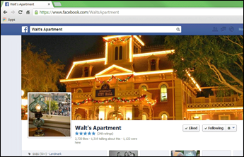
Facebook is certainly not winning award for ‘best in user experience’, but one thing that hasn’t change is the search box. It’s there… small and large.
Facebook 2007 vs. 2013


Some things just shouldn’t change…
